I see illustration everywhere, I’m a bit obsessed…
I think it began when I started getting interested in music and used to pour over the lyrics in an album cover, then turned my attention to the album artwork. The artwork was an advert for the music, it represented what the creator of that music wanted me – the audience – to understand about the sound. It translated a concept from one artform into another. For me this is magical, and what I love about illustration.
Sure, you think you know what illustration is for and where you see it, but the benefits of how illustration can represent information and what platforms it spreads into are far wider than I first thought when I started illustrating. Facilitating the crit / feedback session at Turf demonstrated the widespread creativity that can be classed as illustration.
First to show work was Stefan Szczelkun whose photo books are pictured below – stefan-szczelkun.blogspot.com
We discussed Book Arts and self-publishing our creative concepts, which are both markets with growing audiences. Places like Magma books, Artwords and Persophone Books in London are showcasing a variety of these high-quality artists books, which I suggested as places to explore regularly, as the variants of illustration, narratives and creative book formats are vast.
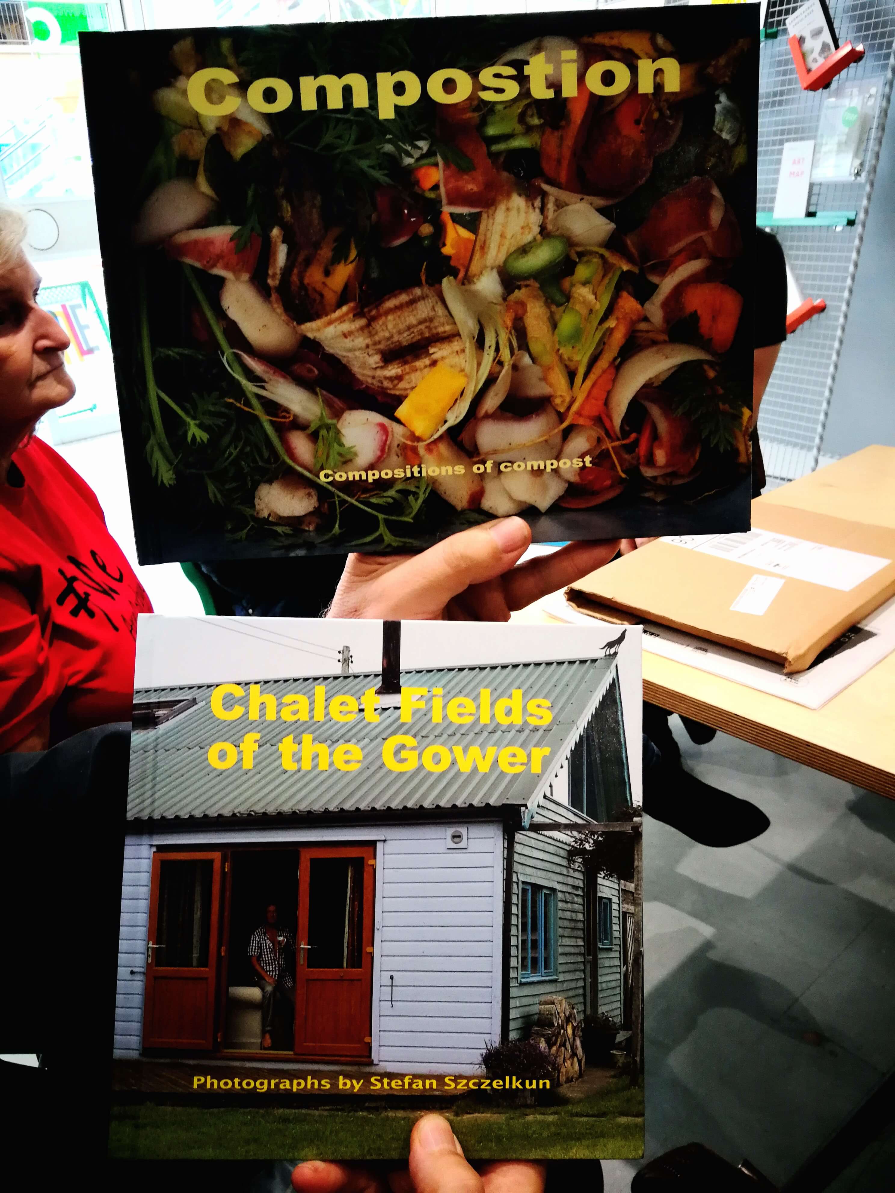
Stefan’s photographs in one book ‘Compostion’ documenting compost waste reminded me of Illustrator Nina Chakrabarti’s obsessions with collecting ephemera in her book ‘My Collection of Collections’ and where beauty is found in the banal.
We also spoke about the power of judging a book by its cover (illustration) and the way a designer can interpret the content so distinctively through layout. Often illustrators have a collaborative task of working on the artwork with a graphic designer who will lay it all out alongside a typographer who will provide the fonts. However there are illustrators who will do this all in one go, and this is valuable for publishers, take note.
Fernando Holguin showed us ink and watercolour illustrations inside sketchbooks, and how they are translated into paintings to form ‘finished’ artworks – 5537gallery.com
I saw the sketchbooks as prolific and intriguing, dynamic and full of stories. Illustrators often test out works in sketchbooks, but these seemed finished in my opinion. Others in the group agreed. We talked about the difference in Fernando’s styles between sketchbook and canvas, and how the medium affects aesthetic. I hope this feedback made Fernando value the work in his sketchbooks more as artworks in their own right.
Where is illustration in black and white stronger over using colour?
Fernando’s black and white sketches reminded me of Marjane Satrapi’s Persopolis, and the dreamy narratives in Henrik & Joakim Drescher’s work where colour was introduced.
Though Fernando is a painter, we discussed the format of the sketchbooks lending themselves to illustrated graphic novels. Since the stories seem to be pouring out in this way, I suggested Fernando checked out Nobrow press for all the wonderfully illustrated graphic novels and Hato Press books for format inspiration.
Robert Lovejoy also showed us many sketchbooks – Robert is part of Turf’s Artist collective, MOSS (Makers of Stuff Squad)

Robert has a style of drawing that is playful, humorous, autobiographical, features local scenes around Croydon, and conveys different emotions. For that reason we spoke about the way Robert’s production of short stories works well, again, to consider self-publishing in zine format, and possibly distributing them in the art book shops mentioned earlier.
On reflection, the autobiographical illustrations were akin to Robert Crumb, with humour that reminded me of Stephen Collins’ work, in particular, the ‘Gigantic Beard that was Evil’.
On Illustrating emotions, I showed Robert the cover of ‘The Book of Sad’ written by Michael Rosen and illustrated by Quentin Blake. This book is compelling in that it tells the story of grief, and grieving from the author’s perspective on losing his son. It’s a great example of how illustration can portray complex emotions and layers of them in one image.
Andy Baker – showed us his acrylic painting next, created in vivid colours of a heron in the foreground at sunset over a sea full of fish, some swimming in other directions.
We discussed how artworks produced for our personal development could one day be of use to meet an illustration brief. For example, this image could be used as a book cover, if cropped in different ways. Turning one form into another, from painting into book cover art, is something that illustrators often do (such as printmaker / artist Olivia Lomonech Gill, converting her printmaking work into illustrations for Fantastic Beasts and Where to Find Them).
Andy questioned some practicalities about the illustration industry, which are wise to be aware of. We spoke about the pitfalls and advantages to be aware of in licensing / contracts royalties and copyright ownership. I also advised that the Association of Illustrators could help with support for illustrators on those areas as well as offering pricing advice for commissions.
Skye Baker – had her children’s book all ready to go – @skye_cant_bake

The book ‘Flump’ illustrating how Dyspraxia can affect day-to-day living was a finished article shown to the group. With that in mind we debated whether Skye should send this to publishers with the artwork as it is or at a more ‘dummy ready’ stage (black and white sketches, with a colour sample) so that publishers could realise the interpretation. This did make us question how much illustrators would be prepared to change elements of their book creating (such as wording, the type of font, and even the character design) if a publishing house gave a contract based on changing those conditions.
Meeting other illustrators working with a focus on representation in Illustration could also be a good way to develop Skye’s work.
For example:
Ellen Li for her illustration of ‘A Girl Like Tilly: Growing up With Autism’.
Jacob V Joyce and Rudy Loewe both also illustrate themes on anti-colonialism, queer identity and gender fluidity, patriarchy and race.
Illustrator-author events are also very good to attend, to share experiences on cracking the right publishing house for work. A local-ish one coming up in October which was mentioned in the session was Wimbledon BookFest
There are many platforms to get Skye’s work out there, with competitions, publishing book fairs and literary agents to approach. I sent Skye and the group some specifics we discussed, which I hope will prove useful.
Agi lastly presented a magnificent wood carving sculpture
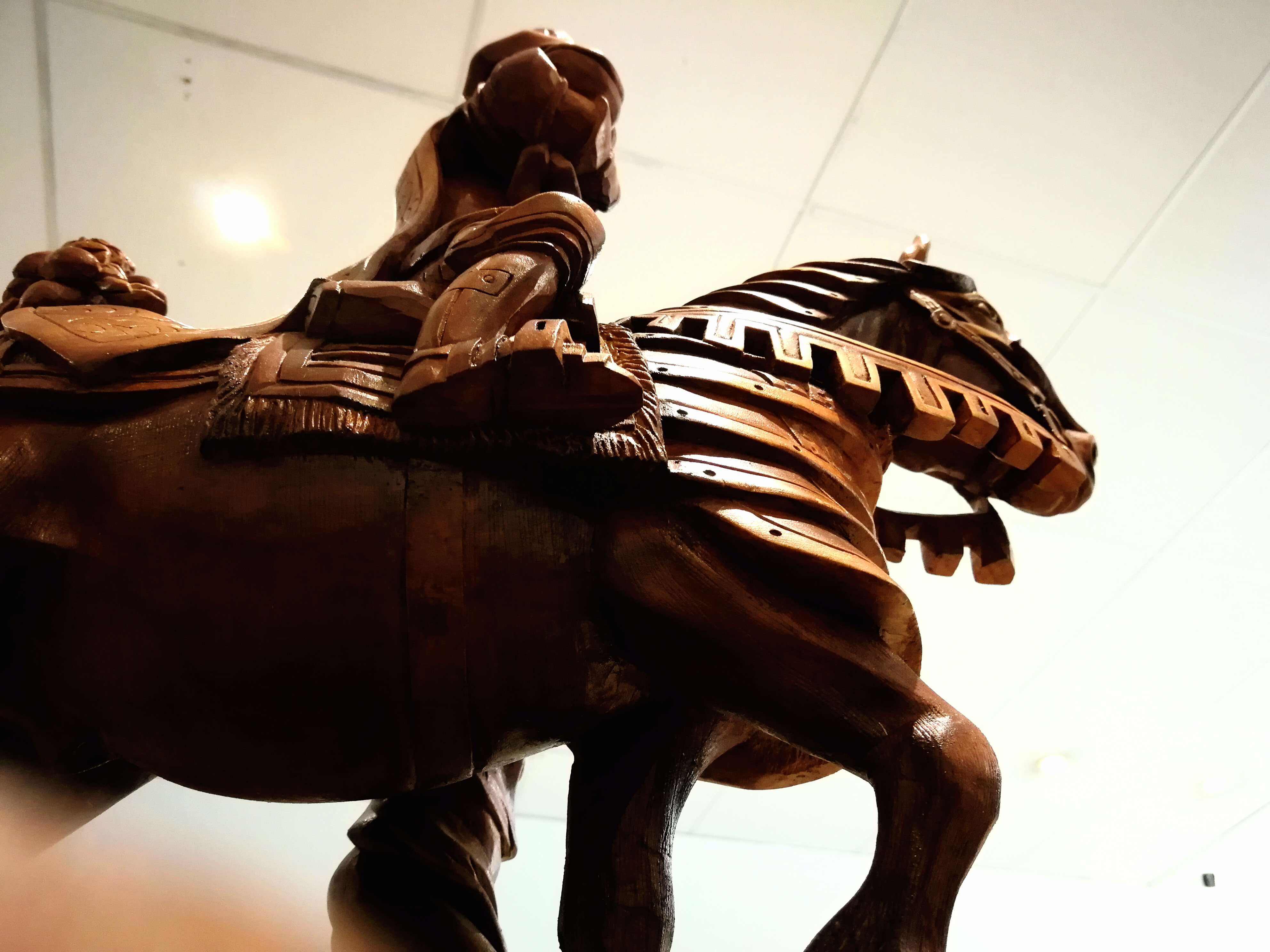
We spoke about the context in which a sculpture could be an illustration. It could provide a story in one form.
We discussed experimenting with photography of the sculpture too. Where lighting, perspectives, angles, surroundings and setting of the work would affect its value and communication. For example, a sculpture set in a gallery space, might be perceived as being higher value than that of a photograph of the work used on packaging design, for a high street brand.
3-D objects can be used in different formats to create illustrations, it doesn’t have to be all 2-D. Claire Brewster’s work is sculptural in many ways, and has translated into illustrations for publishers and editorial works.
Agi’s work definitely closed the feedback session to show that illustration can take many forms.
And with the Enid Marx exhibition on until 23 September 2018, the featured work of this printmaker who’s designs are used on the London Underground’s fabric seating inside tube carriages, really does exemplify that Illustration is everywhere.
—-
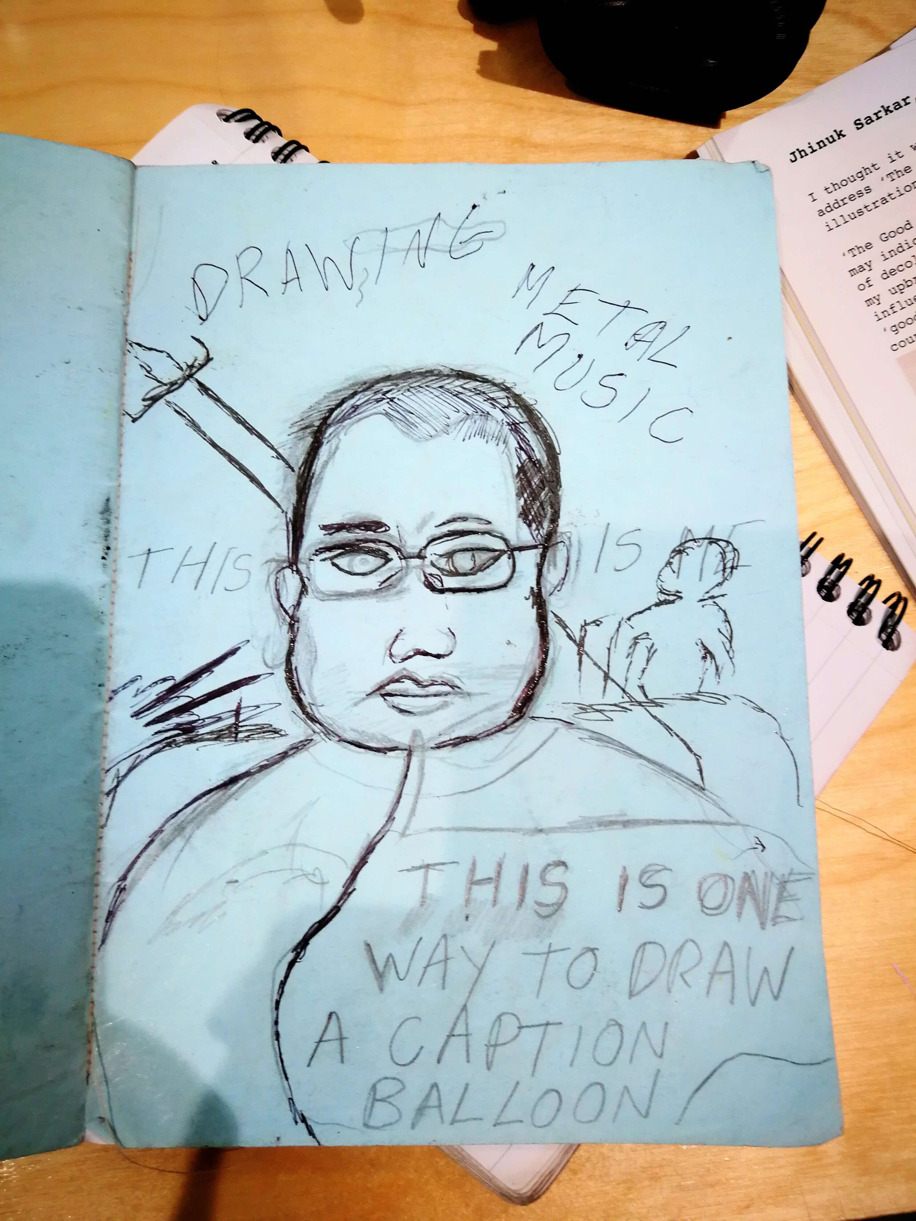
Many thanks to Jhinuk Sarkar for leading the crit and for this writeup!
Turf’s next free feedback session will be on 29 September led by MOTHERS participating artist Gray Wielebinski, followed by Groundwerk 3.5 – an intro to creative writing.